 |
| Modelled in Maya 2012. |
Thursday, 15 December 2011
Speed Model work in progress
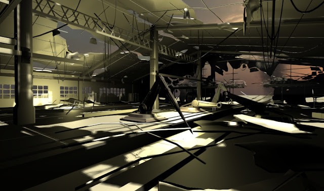
Just a fairly random quick model of dining room I started,about 30mins,textures and chairs are just temporary.Will be adding some elaborate details,lights and some rich colours.
Labels:
Random render of the day
Tuesday, 13 December 2011
Rant: The evolving Alien design...
I've been a massive Alien fan since I was 12,the alien design is without a doubt my favourite cinematic creature but over the years I feel like its gradually been chipped away at by people with little respect for the original.With the release of Prometheus (the is it/isnt it alien prequel) I thought I'd look back at some of the Alien designs.
The first Alien design by HR Giger was I think the most successful,tall and slender the creatures head was domed by a milky translucent cover,in the film hints of the ridges underneath can be seen and stills from behind the scenes show an almost human skull with eye sockets.The hands and feet are notable for there human appearance and the creature is clearly a biped.
By the second film James Cameron decided to make his own changes,removing the dome and exposing the pattern bones below,the alien looks similar but its hands are now fused into a 3 fingered monster,worst highlighted by the queens comedy monster hand grabbing at a trapped newt through floor grids in the films finale.
Alien 3 mixed designs,the dome is back and mouth is smaller and more human,here due to the plot the alien is quadruped.Depending which version of the film you watch the creature is either part dog or part bison,the design works but is let down by some bad blue screen/animation.
Alien 4 is where the bastardisation of the design begins for me, largely not because of the head (now with fangs) but because of buckets of goo,mangled hands and feet that look like they belong on a cow.Add to that the "newborn",the hybrid design that looks like Skeltor with a hangover and saggy boobs(and a vagina in his chest) and the alien queen who now looks like a gelatinous blob topped with a hovering UFO head.
Alien vs Predator seemed to follow this alien design closely (apparently the heads were simply repainted) but the film was so dark that most of the details were hidden.
And then there's Alien vs Predator requiem...the work here is shameful,the neck now clearly fits a human head into it comfortably,the mouth has been carved and hollowed out and now looks like a flapping hinged door and the dome is gone.Things only get worse when we see the alien predator hybrid,a lazy mash-up features which couldn't have taken more than 5 minutes to design.I could rant all day about that film..(its about a pizza boy getting bullied by a jock!!!!..an alien film about a pizza boy!!!)
The first Alien design by HR Giger was I think the most successful,tall and slender the creatures head was domed by a milky translucent cover,in the film hints of the ridges underneath can be seen and stills from behind the scenes show an almost human skull with eye sockets.The hands and feet are notable for there human appearance and the creature is clearly a biped.
 |
| The mouth / jaw hinge is covered with detail,hands are fused but human |
 |
| Slick black design,Stan Winston added his own touch with the hands |
 |
| Alien 3's creature despite being more animal has a more human mouth shape |
Alien vs Predator seemed to follow this alien design closely (apparently the heads were simply repainted) but the film was so dark that most of the details were hidden.
 |
| Not only does the Alien 4 have new feet it now also spits acid..and the 'newborn"... |
Sunday, 11 December 2011
Game project - footage
Short video looking at some of the fantasy world I've been building in Unity3D,around 16hrs of work.Video is captured on "good" (medium) settings.
Thursday, 8 December 2011
Game project: Day 6
Another 2 hours in Unity3D working on my fantasy landscape,adding lots of smaller modelling details and a second stone village.Updating / testing the skybox with free prefab asset I found online,will probably add my own later as well as moving clouds,fog effects etc..
Monday, 5 December 2011
Game project: Day 5
Project came to a halt due to other work over the last few days but managed to get an hour done today,mostly adding trees and smaller props.Needs a lot of testing to get a feel for the paths and where new elements should go in but its starting to look okay..a bit "Skyrim lite"
 |
| This is in game shot,you can see the top of the castle just in the distance. |
 |
| Shot from in the program,trying to use trees sparingly though you cant really tell from above. |
Sunday, 4 December 2011
Rant..Look to the "sky"
Ever since blue screens became green screens and CGI backdrops became run of the mill something bugged me..the CGI skies. I never really got why if you are trying to create realistic fx would you fill a good portion of the screen with something so clearly digital when you could composite a real horizon.
The idea it seems it the the director can "direct the sky" picking and choosing his colour palette and time of day. If so why do so many make terrible choices!,I genuinely don’t think directors think much into it other than "its sunrise..beams of light" or "sunset..beams of light" because that seems to be the default.
George Lucas is a pretty easy example with the Star Wars prequels offending with every combination of sunset/sunrise with every actor in dire need of some gamma correction and every edge looking blurred out,if you look back to the original star wars you will see largely real sky’s (some matte painting) and the contrast is pretty interesting ,It grounds the actors and the fx in a real environment.
 |
| "I'm gonna look at that damn sunset" |
 |
| "Anakin! lets stare at the unconvincing horizon" |
Lucas isn’t the only offender though,Peter Jackson's King Kong remake is a prime offender with so much of skull island green screened. The trouble is that with all this visual control it all ends up looking contrived,in movie world an amazing sunset is so common that no one would ever stop to look,Luke Skywalker would never stop to stare at the sunset.
 |
| Skull island:Terrible monsters,great sunsets. |
 |
| Spiderman 3, wasn't it night like 2 mins ago? |
Labels:
Rant
Monday, 28 November 2011
Game project: Day 4
Not much free time today but managed to get a little work done on my game environment,I done some experimenting with adding a trees and checking overall performance and had some frame-rate trouble.Am I building a game my pc wont be able to play?!.The solution is going to be keeping number of trees down but placing them well and making sure the landscape as a whole works from ground level,being limited by my computer is getting pretty frustrating!.
 |
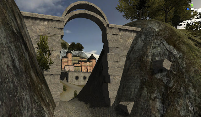
| Added a cliff-side village,some ruins and large viaduct. |
 |
| Low poly village,will have more ground objects and stuff on bridge, terrain still needs painted. |
Friday, 25 November 2011
Game project : Day 3
Small update today on environment,added lighthouse and built some more rocks and steps.Lot of landscaping preparing the map for some of the bigger fantasy type buildings.
 |
| Colin Kaszynski.2011. |
Game project: Day 2
Working on a range of low poly assets and sculpting the terrain for my fantasy world in the Unity game engine.Added some bridges and sculpted out the area a lot more,in the distance there's a place marker for a lighthouse which I hope to build tomorrow if I have time.
 |
| Also added some rocks modelled in Maya for the canyon. |
Wednesday, 23 November 2011
Unity game project : Day 1
Today I start a new mini project... that's epic of course. I'm building a low poly but large scale open world environment in Maya and Unity engine, I've gone for a fairly traditional fantasy style (so far) in this scene partly because its not a style I would usually go for and for the starting area of this map it works.Lot of modelling,textures and detail to add,first shots show the basic landscaping and today's props.
 |
| Entrance to the first village,everything built by me except the trees.Lots of vegetation to add. |
 |
| The mountains are roughed out and will develop as I go, these shots are from in the program (not final in game). |
 |
Sunday, 20 November 2011
Speed model sketch
Playing Skyrim and checking out the models and concepts in the game,thought I would do a very quick model inspired by some of the environments just to make a change from other work I'm doing at the moment.Low detail and just threw on a shader to see how it looked.
Friday, 18 November 2011
Sketchbook - Charcoal swan
Another scan from my old sketchbook,original was A3 size,done with charcoal pencils and a bit of acrylic paint.
 |
Thursday, 17 November 2011
Painting - Portrait
Early digital painting from about 3 years ago,this was one of the first to encourage me to continue learning to work using a tablet.Took around 6 hrs to do in Corel painter using chalks.
Wednesday, 16 November 2011
Speed Drawing Mini Ninja Concepts #2
I've been working hard the last few weeks but not a lot of new 3D work to show so thought I would post some more speed sketches,these were based on the Mini Ninjas Wii game and done in second year of University as quick concepts for an animation.Each took 15-20 mins using Photoshop / Wacom.Some more of the concepts can be seen HERE .
Labels:
artwork,
Drawings,
mini ninjas
Tuesday, 15 November 2011
Inspired 1#
Thought I would post some images of cool work I've seen on the net.These are sculptures by Ray Villafane,the first a massive sand sculpt and the second a massive carved pumpkin sculpt.Check out his website HERE to see more.
 |
| Click image for a closer look |
Labels:
Inspired
Monday, 14 November 2011
HR Giger Species / Old artwork
A few months back I bought 'species design-by hr giger' the art book showing the process behind creating 'Sil' the alien lead on the film Species,I had wanted the book for years but it was always a bit pricey but I did have a old issue of Cinefantastique magazine showing the details making the creature.
I thought Steve Johnson did a good job bringing the creature to life and he mentions in the magazine that he was upset the films lighting was rushed as it meant that Sil's transparent body was never seen properly.One scene which I thought worked perfect was the underwater alien sex scene,created using strobe lights underwater it only lasts a few seconds but that was enough for me to want to draw it.
I was 15 when I drew this from memory,its gotten a bit damaged and dirty over the years,I never did finish it I think because I ran out of the blue pencil I was using!.
 |
| The original is about 1 meter x 1 and a half meters big, I found it pretty crushed and tried to flatten and photograph it. |
Saturday, 12 November 2011
Galleon Model
I built this model earlier this year just for fun / practice but never had time to to finish it proper,was playing around in Maya for a bit and thought I would try adding some ncloth sails today.The ship took a couple of hours to build,sails were added in 5 Min's,the body lacks a lot of detail still,I had planned on building quite elaborate hull details.
Friday, 11 November 2011
Painting
This is my first painting done with a Wacom tablet from about a year ago,I switched after my Trust tablet broke.Took a little practice to get used to using Wacom but sped up my work a lot,this was a quick practice painting I did.Could use some blending and clean up.
Thursday, 10 November 2011
Surreal concepts
Back in 2nd year of university I did a surreal animation based on characters interacting,I came across some of the early concept renders on my hard-drive showing how the character would evolve over the course of the animation.In the initial concepts I planned on showing the character as semi transparent with moving pieces inside its body,the idea was inspired by HR Gigers design for 'species' where the alien Sil had translucent skin.
Labels:
Animation,
artwork,
Character,
Concept,
University
Wednesday, 9 November 2011
Concept Art : Mermaid
Tuesday, 8 November 2011
Artwork : Portrait
Digital speed painting I did about a year ago,created in Corel painter IX using chalks and wacom tablet.Think it took 2 or 3 hours,never finished a lot of detail.
 |
| Click to view fullsize. |
Labels:
artwork,
Digital,
Painting,
sketchbook,
speed
Razor's edge: Art project
Dragging out my old art portfolio and having a look through it,this is one of my projects from a few years ago.Was made with some clear plastic and a scanner,the concept was for a Waterstone's advert promoting crime/mystery fiction.
Sunday, 6 November 2011
Speed Model : Bedroom
Monday, 31 October 2011
Early 3D concept
Old 3d concept shot of an animation idea I had about the life of an artist's mannequin.This is an idea for the final shot as its replacement arrives and sees the horror of its predecessor.
Labels:
artwork,
Concept,
sketchbook
Saturday, 22 October 2011
Artlantis Studio Rendering - Review
Artlantis studio is another "realtime renderer",by now Ive learnt realtime means a nice preview..and you still have to hit render at some point!.My first time trying out the program I didn't give it much of a chance,the included sample files are fine but rendering them out was painfully slow.I decided to give it a second chance though and import a .obj of my own scene from Maya.
Once in the program you import a scene or model,there is sunlight setup allowing for location,time of day and cloud cover.A material bank containing some presets such as wood,floors etc and some simple objects you can use.The setup is fairly easy and the preview window will give you a pretty good idea how the scene is going to look.Render settings include radiosity and the main draw of the program is that it creates indoor and outdoor natural lighting well.
The interface itself while being easy to navigate and understand i found a little off putting,a nicer layout would have drawn me in a lot quicker as when i actually rendered my scene the render time was pretty good.
There is a couple problems in the program,there are only 2 render options (high or low) for anti aliasing and 3 similar settings for radiosity and adding additional lights slow the render time massively.The program also crashed a few times when changing basic settings on a low poly scene.
I'm still undecided on what i think of Atlantis,its certainly worth trying again though.
Once in the program you import a scene or model,there is sunlight setup allowing for location,time of day and cloud cover.A material bank containing some presets such as wood,floors etc and some simple objects you can use.The setup is fairly easy and the preview window will give you a pretty good idea how the scene is going to look.Render settings include radiosity and the main draw of the program is that it creates indoor and outdoor natural lighting well.
 |
| 5 Min (1280x720) render with hard shadows and high radiosity |
 |
| Added soft shadows,7 Min render.Click images to enlarge. |
There is a couple problems in the program,there are only 2 render options (high or low) for anti aliasing and 3 similar settings for radiosity and adding additional lights slow the render time massively.The program also crashed a few times when changing basic settings on a low poly scene.
I'm still undecided on what i think of Atlantis,its certainly worth trying again though.
Wednesday, 19 October 2011
Unity 3 lighting tests
Spent a hour or two playing around in Unity 3 engine,previously I found the final rendered game graphics to be a bit disappointing so I thought I would experiment with lighting options and see what I could come up with.I imported a couple of my Maya models into the engine to test indoor lighting and anti-aliasing effects.
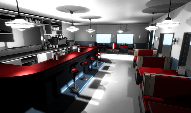 |
| Some realtime shadows,image effects applied to camera to soften jaggy edges |
 |
| Forward lighting with some point lights to fake ambience |
Saturday, 15 October 2011
Friday, 14 October 2011
Character Model
Character model from a few weeks ago,most of the detail is on the head.The coat and clothing
could use some work and a stronger design.
could use some work and a stronger design.
 |
| Rendered real-time in Autodesk Showcase |
Subscribe to:
Comments (Atom)


